Patient Demographic Analysis
Comparing patient demographics between Main Street Family Medicine, PLLC, and New Heights Clinic, A Professional Nonprofic Corporation.
In my roles at Main Street Family Medicine and New Heights Clinic, I compared patient demographics between the two clinics to better inform our leadership on how to care for both populations and grow each clinic separately.
The New Heights Clinic uses paper charts, and I was fortunate enough to have multiple volunteers help me manually collect information from a representative random sample of paper charts. Main Street Family Medicine uses an Electronic Medical Record (EMR) with very limited data capabilities, so I crafted work-arounds to generate as much data as I could despite the vast limitations. I started the presenation with simple Exploratory Data Analysis (EDA) of both clinics, then turned to a statistical comparision between the two. The results gave us insight on how the two clinics differ from each other so we could know what their unique needs are and how to grow as a result.
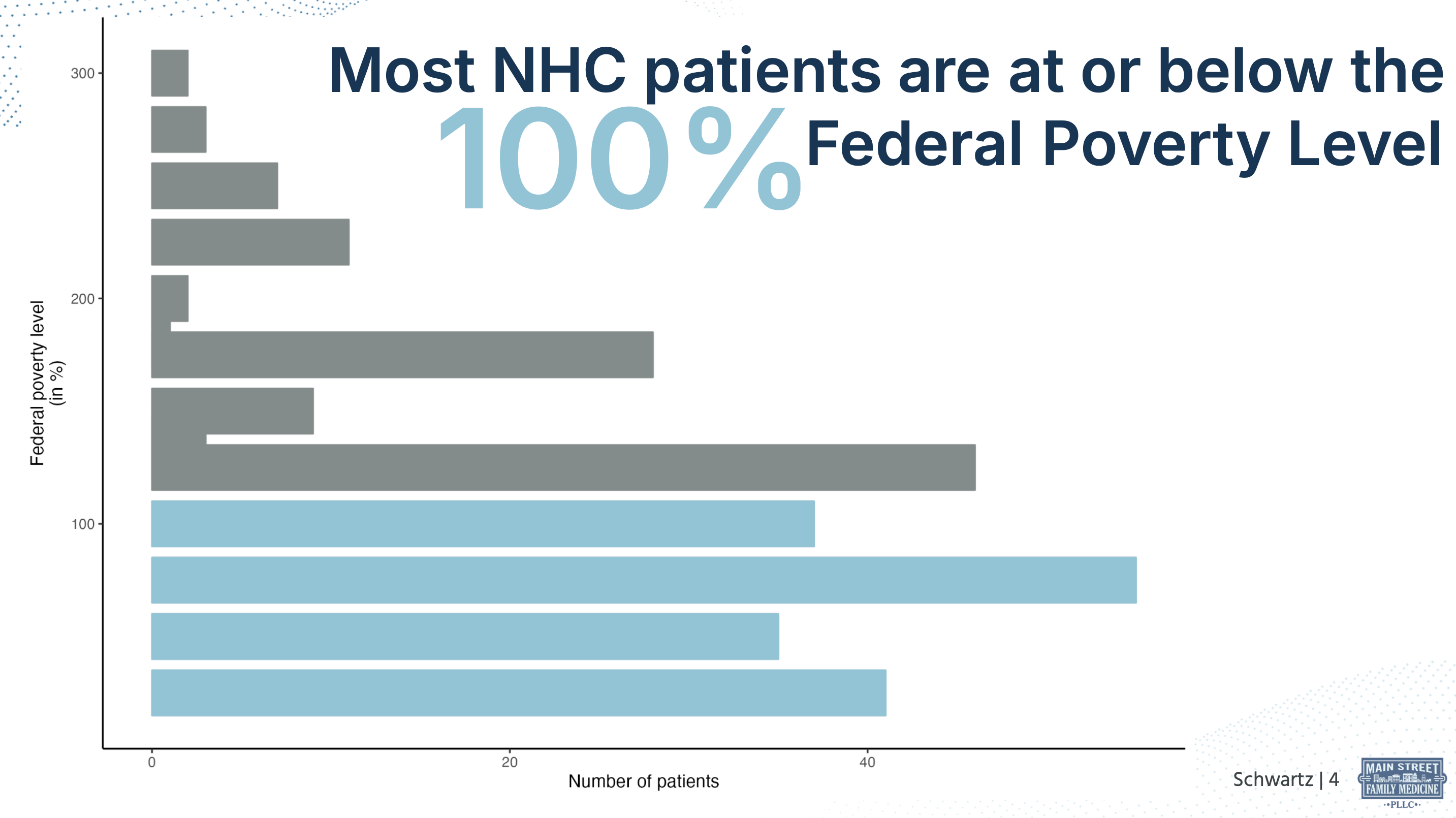
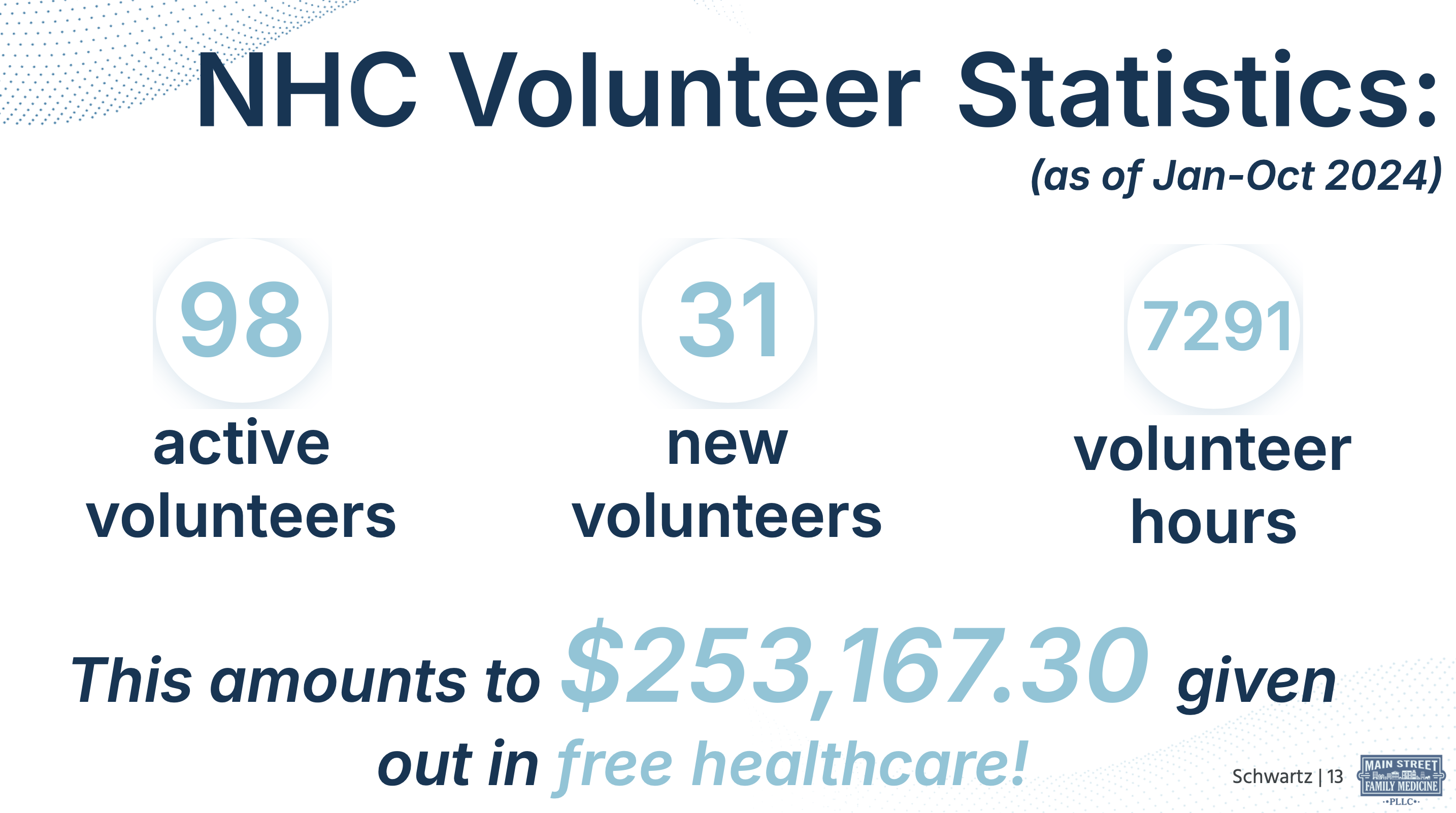
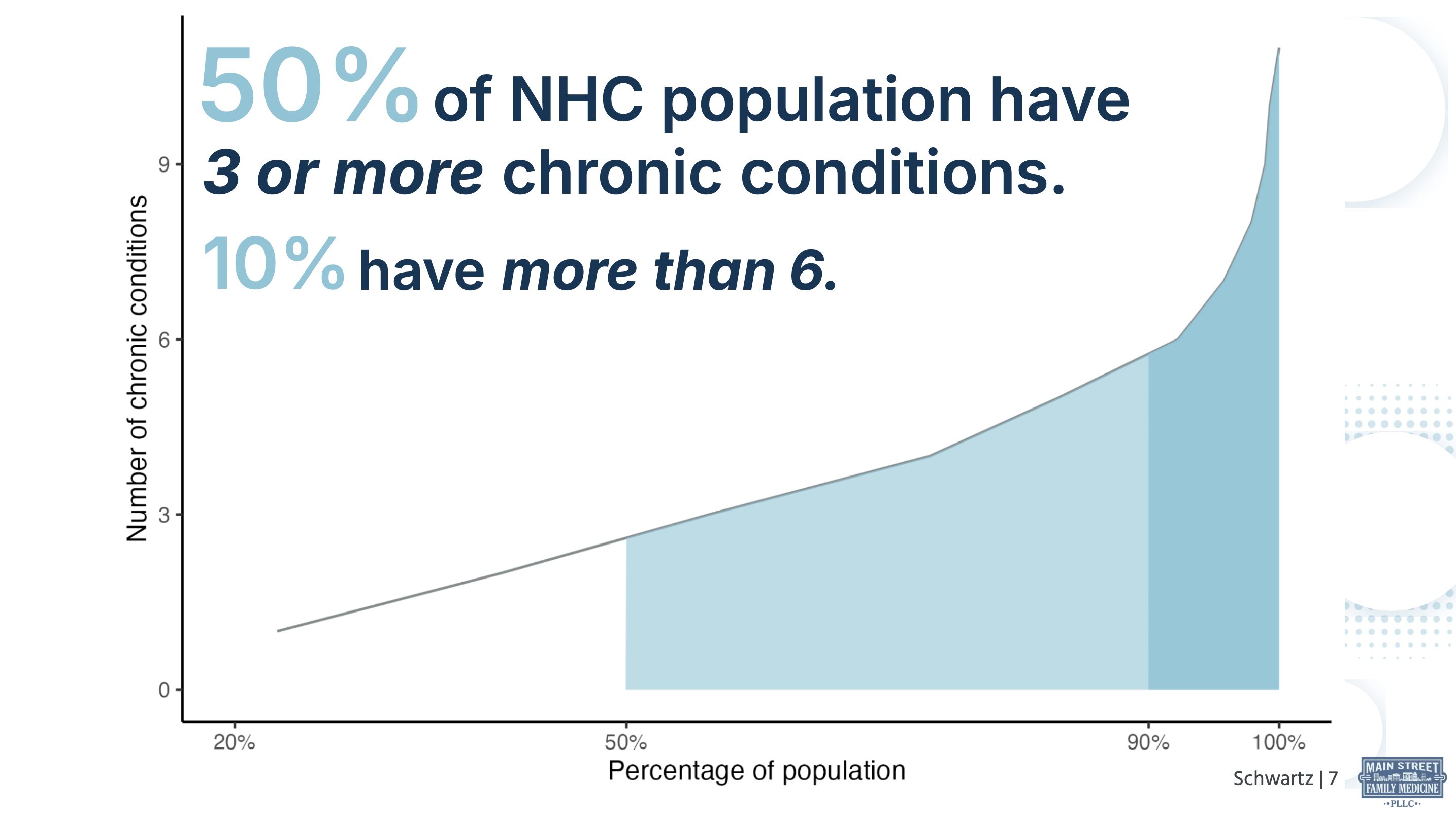
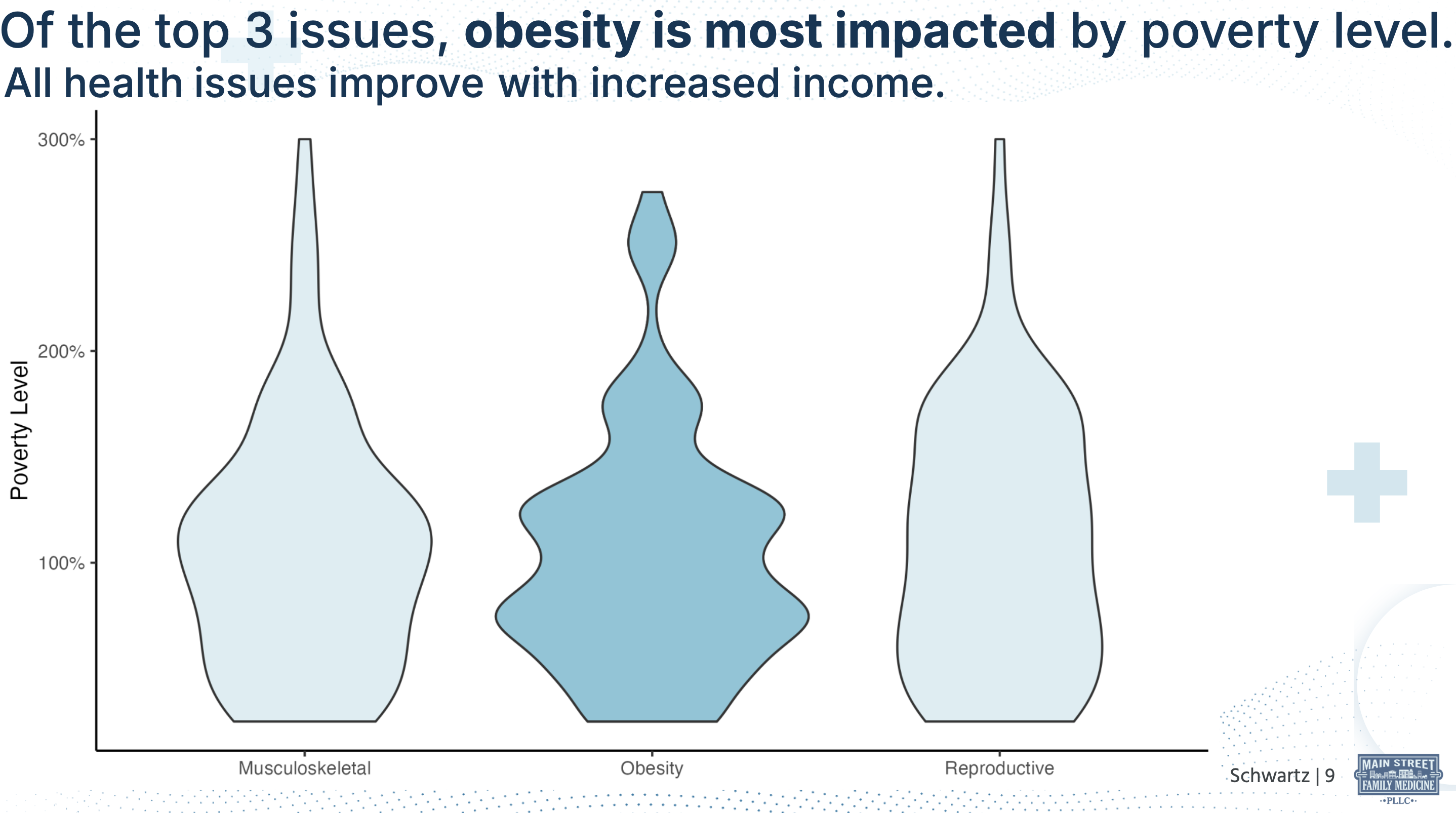
Below includes a few screenshots from the presentation and some relevant code.
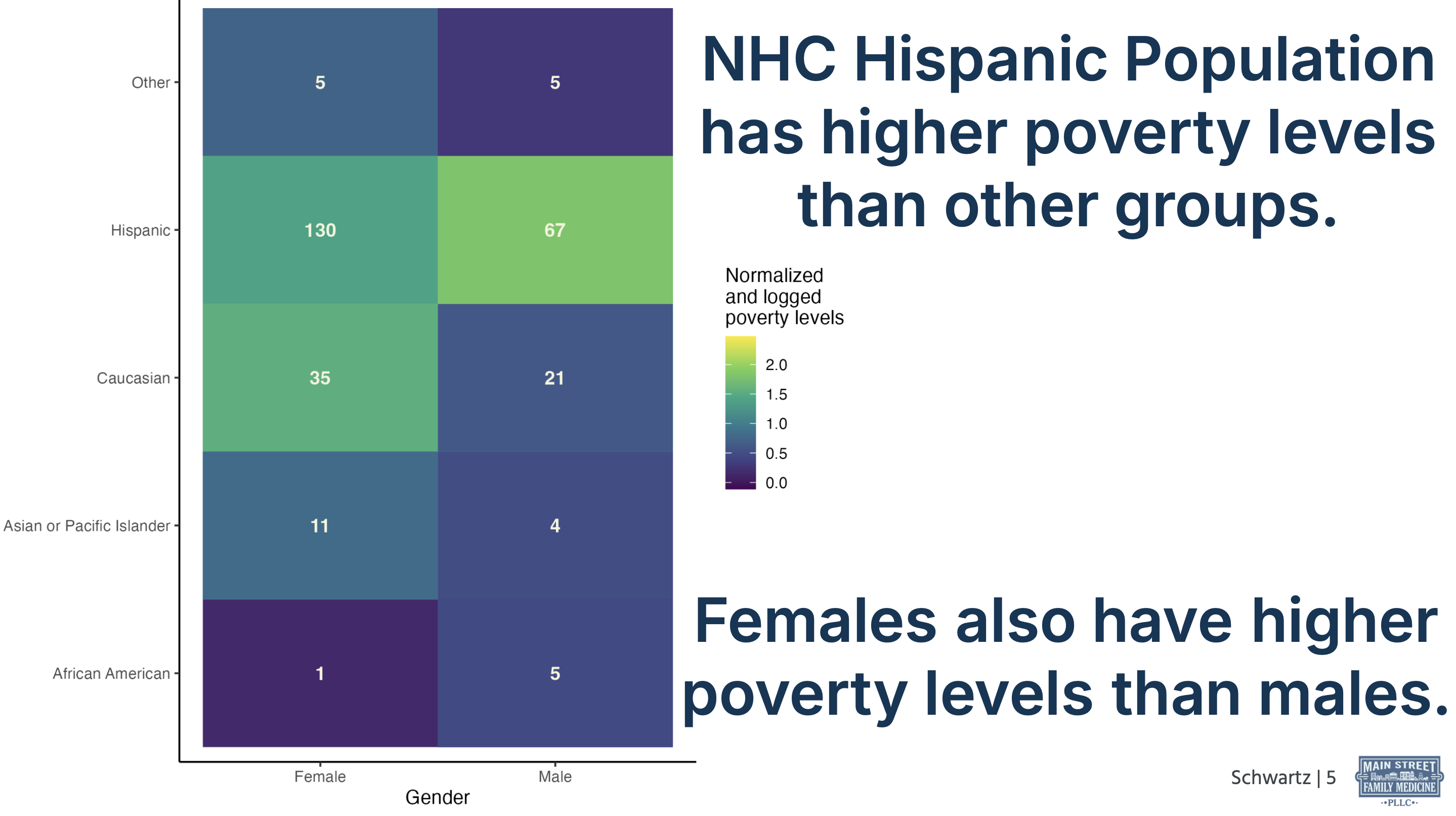
        ## CODE FOR ABOVE HEATMAP

        #select necessary cols
        ds_demo=ds %>%
        dplyr::select(ethnicity, gender, employment, faith, mo_income, household_size)

        #find pov level
        ds_demo = ds_demo %>%
        rowwise() %>%
        mutate(poverty_level = predict_poverty_level(household_size, mo_income, pov)) %>%
        mutate(poverty_level = as.numeric(str_remove_all(poverty_level, "%")))

        #understand missing data
        aggr(ds_demo, col=c('navyblue','red'), numbers=TRUE, sortVars=TRUE, labels=names(data), cex.axis=.7, gap=3, ylab=c("Histogram of missing data","Pattern"))

        #use random forest method in mice to impute
        ds_demo_imp <- mice(ds_demo,m=5,maxit=50,method = "rf",seed=500)
        ds_demo_imp = complete(ds_demo_imp,1)

        #standarize ethnicities
        ds_demo_imp = ds_demo_imp %>%
        mutate(ethnicity = case_when(
            ethnicity == "african american_other" ~ "other",
            ethnicity == "caucasian_native american" ~ "other",
            TRUE ~ ethnicity
        ))

        #normalize (find proportion of each group (gender and ethnicity) then normalize pov level by proportion)
        #find count of each group
        ds_demo_imp_prop = ds_demo_imp %>%
        group_by(gender, ethnicity) %>%
        summarize(count=n()) %>% #female hispanics are the highest at count of 130. normalize to this
        mutate(prop = count/130)
        #join prop to full ds
        ds_demo_imp_prop_join = left_join(ds_demo_imp,ds_demo_imp_prop,by=c("gender"="gender", "ethnicity"="ethnicity"))
        #normalize pov level
        ds_demo_imp_prop_join=ds_demo_imp_prop_join %>%
        mutate(norm_pov = poverty_level*prop)
        #look at distribution within each group to see which transformation would be the best
        ds_demo_imp_prop_join %>%
        ggplot()+
        geom_histogram(aes(x=norm_pov))+
        facet_grid(gender~ethnicity) #distributions are mostly skewed, so log transformation will work well


        #tile graph for ethnicity, gender, and pov level

        #make annotation for graph
        ds_demo_imp_annotation = ds_demo_imp %>%
        group_by(ethnicity, gender) %>%
        summarize(count=n()) %>%
        rename(x = gender) %>%
        rename(y= ethnicity) %>%
        rename(label = count) %>%
        mutate(label = as.character(label))

        #graph
        ds_demo_imp_prop_join_plot = ds_demo_imp_prop_join %>%
        ggplot() +
        geom_tile(aes(x=gender,y=ethnicity,fill=log10(norm_pov)))+ #log poverty level since not equal proportion of people in each group
        scale_fill_viridis_c(name = "Normalized\nand logged\npoverty levels")+
        theme_classic() +
        labs(
            title = "Our Hispanic population has the highest poverty levels.",
            subtitle = "Females also have higher poverty levels than males.",
        ) +
        xlab("Gender")+
        ylab("Ethnicity")+
        scale_x_discrete(breaks = c("female", "male"),
                        labels = c("Female", "Male")) +
        scale_y_discrete(breaks = c("african american", "asian/pacific islander", "caucasian", "hispanic", "other"),
                        labels = c("African American", "Asian or Pacific Islander", "Caucasian", "Hispanic", "Other")) +
        geom_text(data=ds_demo_imp_annotation, aes(x=x, y=y, label=label), color="beige", fontface="bold")
NOTE: Thank you to iStock by Getty Images for the stock demographic image used for this project.